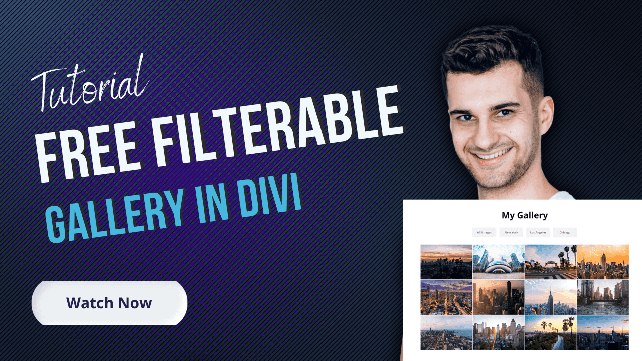
Right now, we can only filter projects in Divi by using the Filterable Portfolio module. Even though the module is very handy, it would be cool if we’d be able to actually filter other modules as well. This is exactly what an awesome free plugin from Daniel Völk deals with. You can literally filter any modules by adding classes to columns in which the modules are located. In this tutorial, I’m going to show you a simple and clean filterable team section you can use for displaying team members from different departments. At the end of the post, you can also download the layout used in this tutorial for free. Let’s get started!
1. Download the Divi Filter
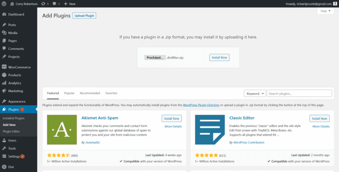
The first thing we need to do is to download the free Divi Filter plugin which I’m using in the tutorial. Simply visit the plugin’s website and download for free.
2. Upload and activate the plugin
This is a step you’ve probably done many times before with other plugins → just click on Plugins → Add New → Upload Plugin and choose the Divi Filter. Don’t forget to activate it.
3. Create a new page or open an existing one, enable the Divi Builder
Now, we can start creating the actual layout. Create a new page and enable the Divi Builder (Visual Builder) – you can also continue on an existing page.
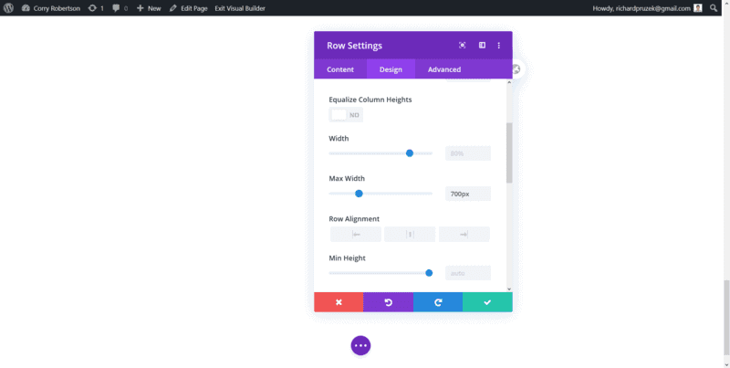
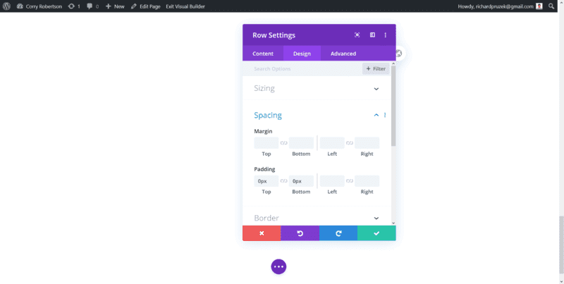
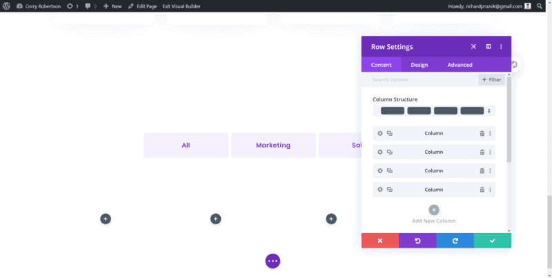
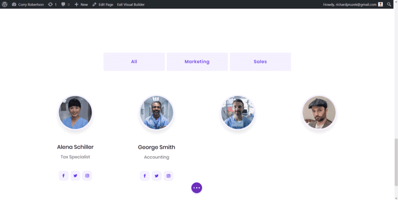
4. Create a new section and insert a row with three columns
This is going to be our section for filterable buttons. I’m using three buttons in this tutorial to display all team members, team members in the marketing department, and people from sales. If you have more departments you’d like to filter, simply add more columns.
Set the max-width of the row to 700px → you may want to choose a different value if you wish to have more columns.
Click on Use Custom Gutter Width and choose 1. This will remove space between the buttons we are going to add in a while.
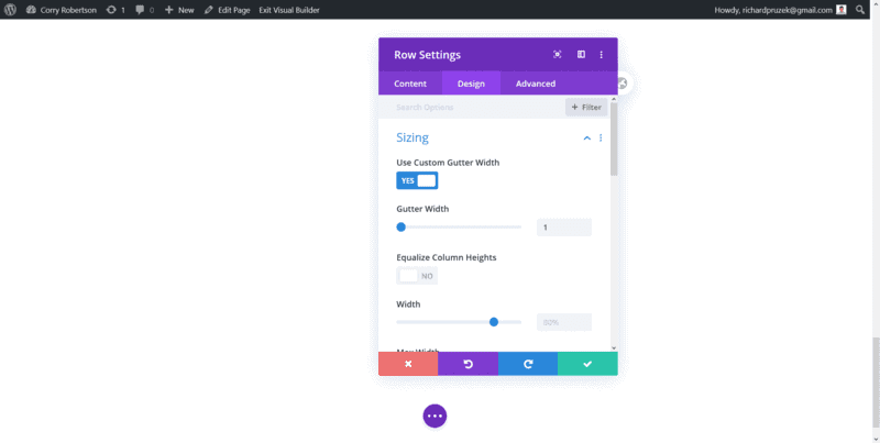
Remove padding from the row. You may eventually add it at the end but I just wanted to have my row tiny so my padding-top and padding-bottom are set to 0.
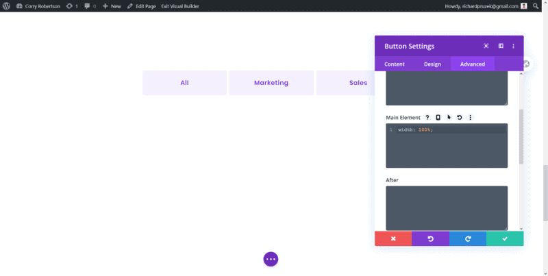
5. Add 3 buttons
We are now going to add a button to each column of our new row. You can style the button according to your preferences. Here is the styling that I did:
- Button Alignment → Center
- Use Custom Styles For Button → Yes
- Button Text Size → 17px
- Button Text Color → #5E2CED
- Button Text Color On Hover → #ffffff
- Button Background → #F4F0FE
- Button Background On Hover → #5E2CED
- Show Button Icon → No
- Padding Top → 20px
- Padding-Bottom → 20px
- Transform Scale → 97% (both values)
- Custom CSS – Main Element → width: 100%;
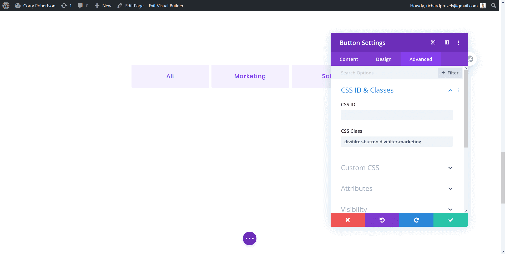
6. Give the buttons a df-button class
Got to Advanced Tab of Button Settings → CSS ID & Classes and paste this CSS Class: df-button.

7. Add a class for department
Now, we can add one more class to the button which will filter the people from the selected department. If we don’t add any more class and leave just df-button class, we’ll have all team members displayed. This is what I use for the “All” button.
For buttons filtering only people from a particular department, add one more class to the particular button. For example, for the marketing button, I added dfc-marketing class.
Remember that you always have to have the df-button class there as well!
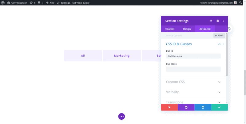
8. Create a new section and give it df-area class
Now, we’ll create a new section where our filterable content will be. Go to the Advanced tab of Section Setting → CSS ID & Classes and give the section df-area class.
Section Styling:
- Padding Top → 100px
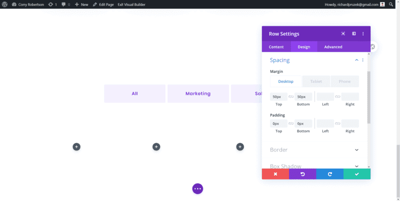
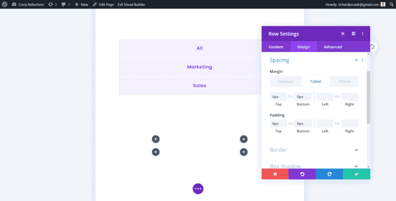
9. Create a new row with 4 columns
Row Styling:
- Margin Top on Desktop → 50px
- Margin Bottom on Desktop → 50px
- Margin Top on Tablet/Phone → 0
- Margin Bottom on Tablet/Phone → 0
- Padding Top → 0
- Padding Bottom → 0
- Use Custom Gutter Width → Yes (2)
- Custom CSS – Main Element → overflow: visible!important;
Even though the overflow can also be managed in the builder, I’ve still been having issues with it on mobile (not only on this pages).
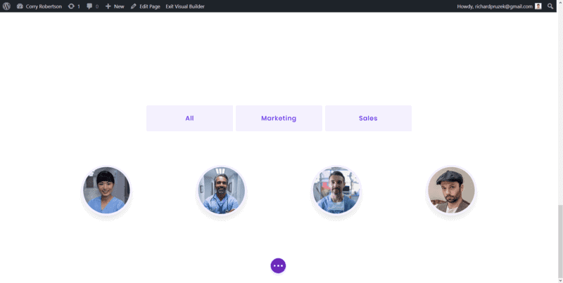
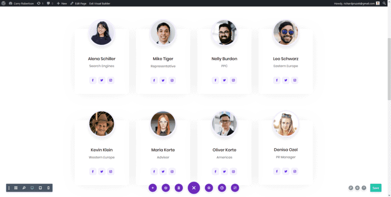
10. Add team members images
Now, we’re going to add images of our team members. All images need to be in square format, so width and height need to be the same.
Simply add a new image to each column. Here’s the styling:
- Width: → 50%
- Module Alignment → Center
- Border – Rounded Corners → 50%
- Border Width → 6px
- Border Color → #f4f0fe
- Box Shadow Horizontal Position → 0
- Box Shadow Vertical Position → 12px
- Box Shadow Blur Strength → 18px
- Box Shadow Spread Strength → -6px
- Shadow Color → rgba(0,0,0,0.14)
- Margin Top → -50px
- Margin Bottom → 0
11. Add names
Add a new module under the team member’s image and choose text. Paste the name of the team member. Below is the styling:
- Text Font → Poppins
- Text Font Weight → Regular
- Text Text Color → #1f1f1f
- Text Text Size → 20px
- Text Alignment → Center
- Margin Top → 50px
- Margin Bottom → 10px

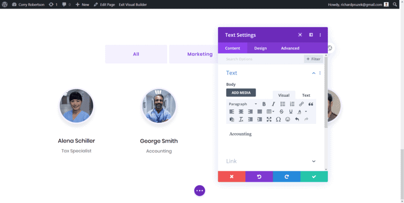
12. Add positions
Below the team member’s name, add a new text module for his/her position. Here’s the styling:
- Text Font → Poppins
- Text Font Weight → Regular
- Text Text Color → rgba(31,31,31,0.6)
- Text Text Size → 16px
- Text Alignment → Center
- Text Line Height→ 1.8em
13. Add social networks
Below the position text, add a social media follow module.
Here’s its styling:
- Padding Top → 20px
- Padding Bottom → 40px
- Module Alignment → Center
- Icon Color → #5e2ced
- Icon Font Size → 13px
- Border – Rounded Corners → 10px
- Custom CSS – Social Icon→ padding: 5px;
- Social Network Background → #F4F0FE
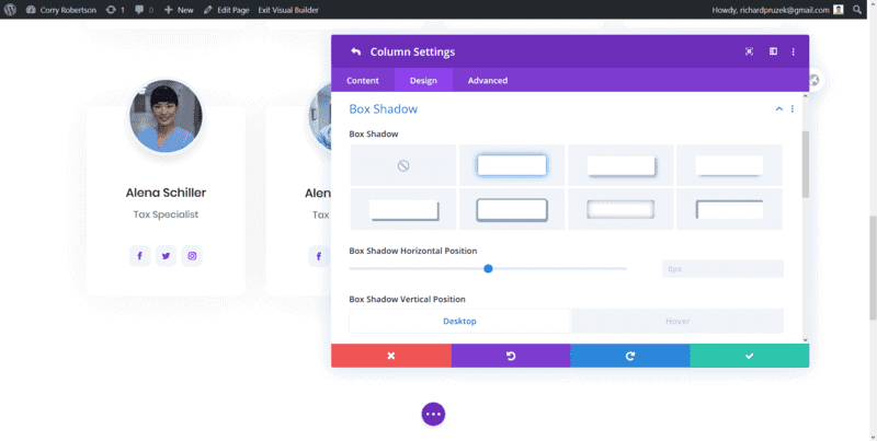
14. Style the columns
Open the row settings and then the column settings and style each column according to the list below:
- Border – Rounded Corners → 10px
- Box Shadow Horizontal Position → 0
- Box Shadow Vertical Position → 0
- Box Shadow Vertical Position on Hover → 50px
- Box Shadow Blur Strength → 80px
- Box Shadow Spread Strength → 0
- Box Shadow Color → rgba(0,0,0,0.06)
- Box Shadow Color on Hover → rgba(0,0,0,0.14)
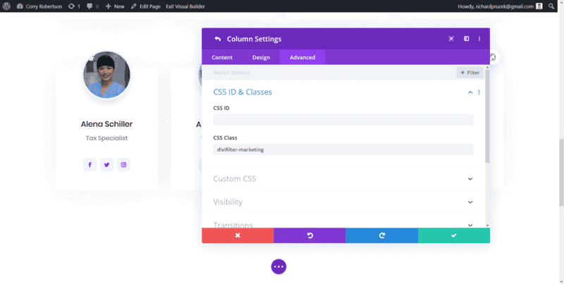
15. Give the columns filterable classes
For example, for a team member from marketing, we’re going to add the dfc-marketing class. It is the same class that we added to the button representing the particular department.
For people working in the sales department, you may want to add a class like dfc-sales etc.
16. Duplicate the rows for more team members
Remember that you can only have one person in each column so in order to add more than 4 people, simply duplicate the row and change images, names, positions and column classes for new team members.
17. Add CSS for better mobile experience
Since we don’t want the user to recognize that we use different rows on mobile (natively, there is space between rows), we can set the margin to all columns via CSS. Add this code to your stylesheet or to Divi → Theme Options → Custom CSS
.df-area .et_pb_column {
   margin-bottom: 80px!important;
}
18. Add animation (optional)
The Premium version of the Divi Filter plugin also comes with a great feature that allows you to add animation once you click a filterable button. Below is the animation I’m using in the demo example. Paste the code to your stylesheet or to Divi → Theme Options → Custom CSS
.df-animation {
   animation: rp-animation; animation-duration: 2s;
}

@keyframes rp-animation {
    0% {opacity: 0; transform: translatey(50px);}
    100% {opacity: 1; transform: translatey(0px);}
}