As for 2023, Divi is the most popular premium WordPress theme. It is a flexible and feature-rich theme that can be used to build a variety of websites, ranging from personal blogs to eCommerce sites. Divi is known for its drag-and-drop visual builder that allows users to create custom page layouts and templates with its amazing Theme Builder. Divi designers have also prepared a large number of pre-designed templates to make it easy for users to get started with their website.
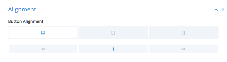
Responsive setting in Divi
Breakpoints in Web Design
Breakpoints are a key aspect of responsive web design. They are specific screen widths at which the design of a website changes to accommodate different screen sizes. Web designers use breakpoints to ensure that a website looks and functions well across various devices, from desktops to smartphones. Breakpoints can be set using CSS media queries and can be adjusted to create a design that works best for a particular device. Some of the popular page builders for WordPress make it easy for users to work with breakpoints without using CSS at all.
Why Making Your Website Responsive Matters
The number of people accessing the internet via mobile devices has been increasing rapidly in recent years. In fact, as of 2021, mobile devices account for over half of all global internet traffic. This means that it is more important than ever to have a website that is optimized for mobile devices. A mobile-friendly website not only ensures that users have a good browsing experience on smaller screens, but it also helps to improve a website’s search engine rankings.

Man browsing internet on phone
Divi Responsive Breakpoints
The Divi Theme has only 3 breakpoints which is less than many of its competitors (Breakdance to name one). The breakpoints are
- >981px for desktops
- 480px – 980px for tablets
- <479 for mobiles
This can make it challenging to create a fully responsive website that looks great on various screen sizes. However, there are plugins available, such as the Divi Responsive Helper, that can make it easier to design a mobile-friendly website with Divi. With the right tools and techniques, it is possible to create a beautiful and functional website with Divi that works well on all devices.


[…] You can also learn more about Divi breakpoints in my article. […]