In this little tutorial, I’m going to show you how to change the order of columns on your mobile device in Divi. Unfortunately, Divi doesn’t support the flexbox layout by default so we’ll need to use custom CSS.
1. Give your row a custom class
In my case, I will go with rp_row class but you can choose your own.
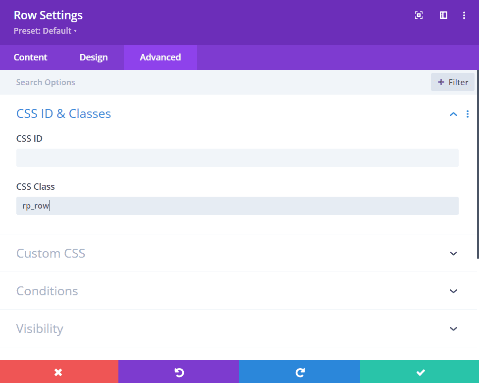
Give custom class to your row
2. Add custom CSS to your Divi Theme Options
Go to Divi → Theme Options → Custom CSS (or your stylesheet) and add the following code:
@media only screen and (max-width: 479px) {
   #page-container .rp_row {
     display: flex;
     flex-wrap: wrap;
   }
   #page-container .rp_row .et_pb_column:first-child {
     order: 2;
   }
   #page-container .rp_row .et_pb_column:nth-child(2) {
    order: 1;
   }
}
The code above changes the column order on mobile. You could also change the breakpoint to have the code applied to tablet as well. Just modify the code to the following:
@media only screen and (max-width: 980px) {
   #page-container .rp_row {
     display: flex;
     flex-wrap: wrap;
   }

   #page-container .rp_row .et_pb_column:first-child {
     order: 2;
   }

   #page-container .rp_row .et_pb_column:nth-child(2) {
     order: 1;
   }
}
More about Divi Breakpoints
You can also learn more about Divi breakpoints in my article.